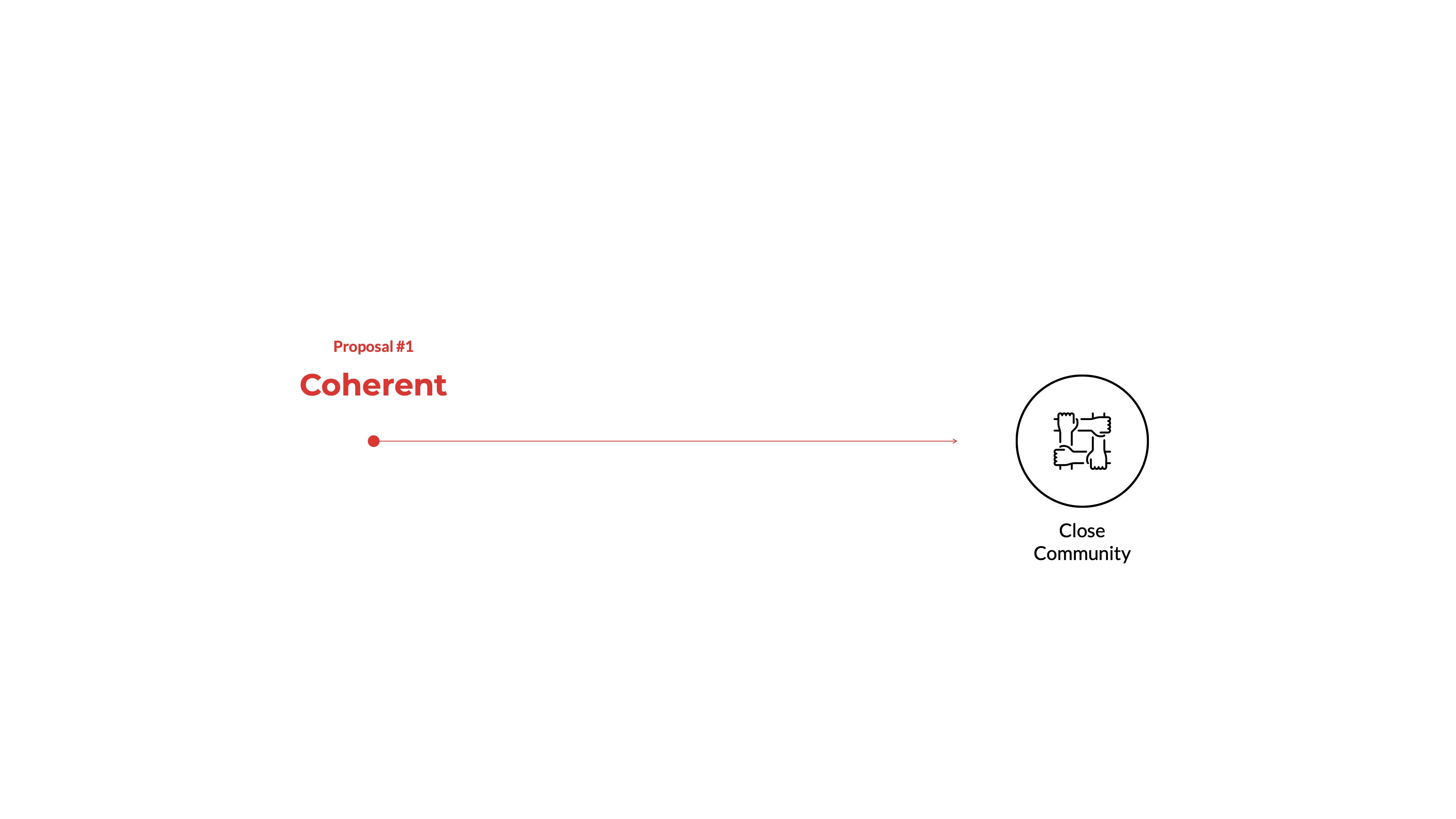
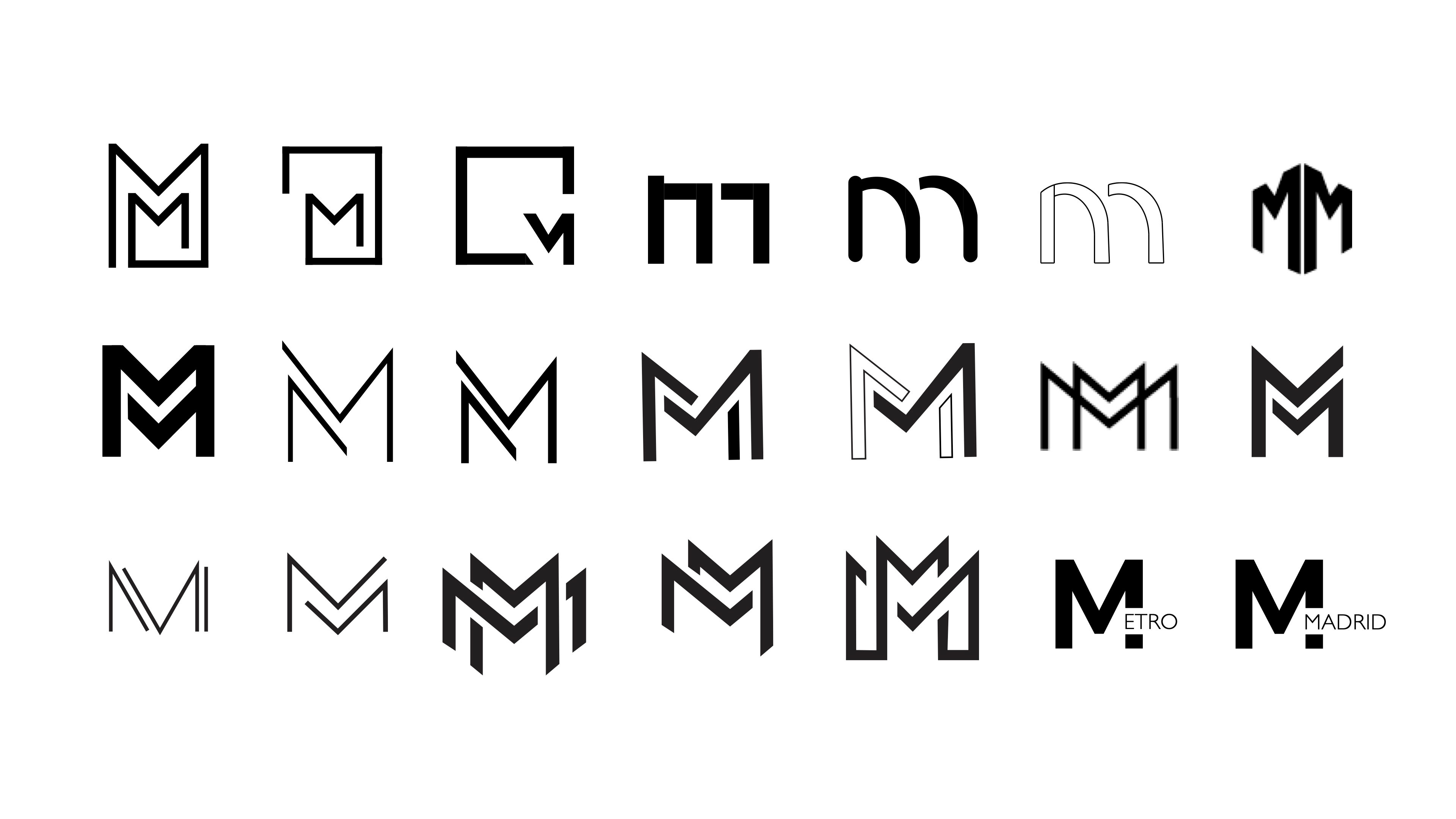
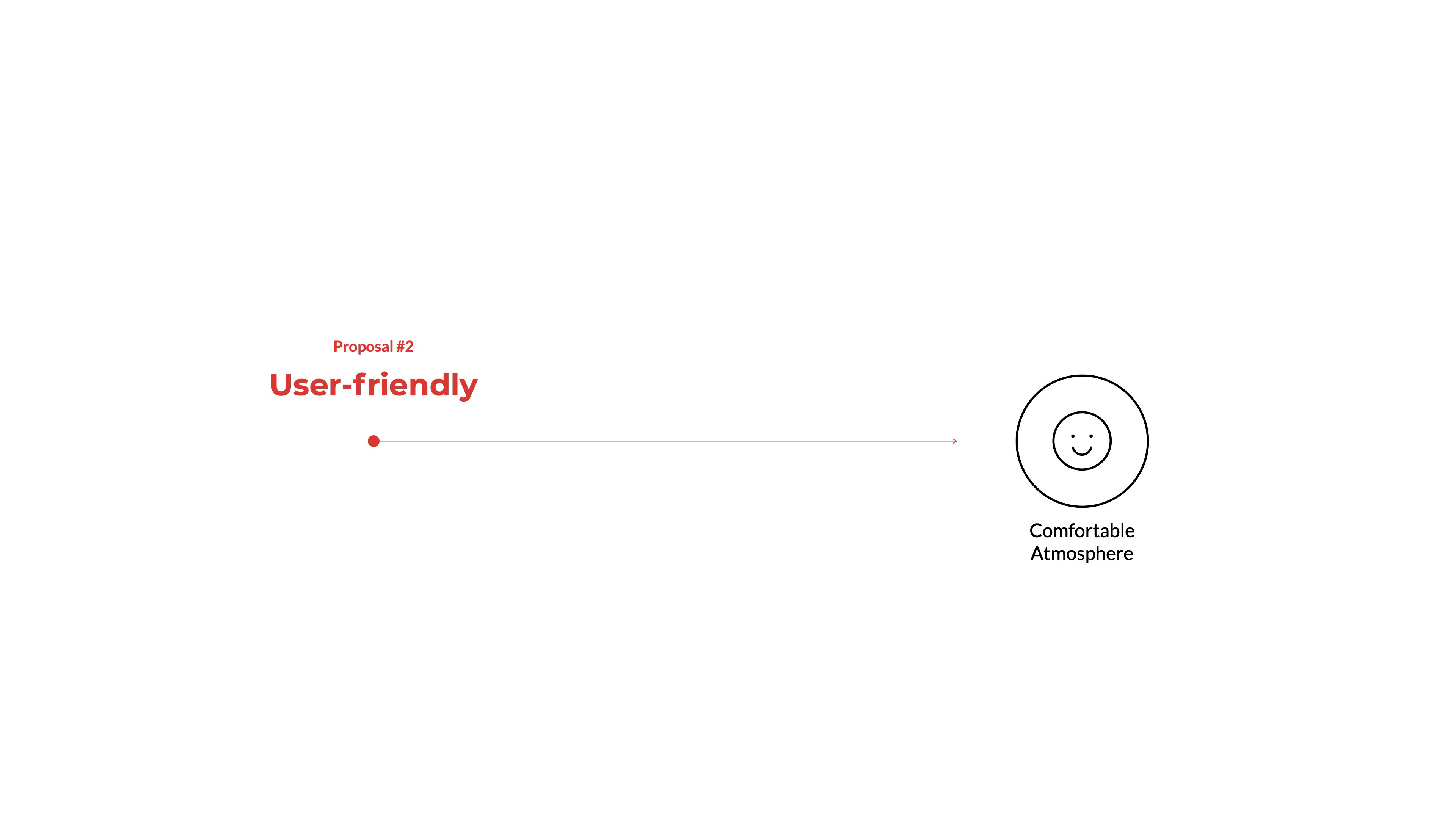
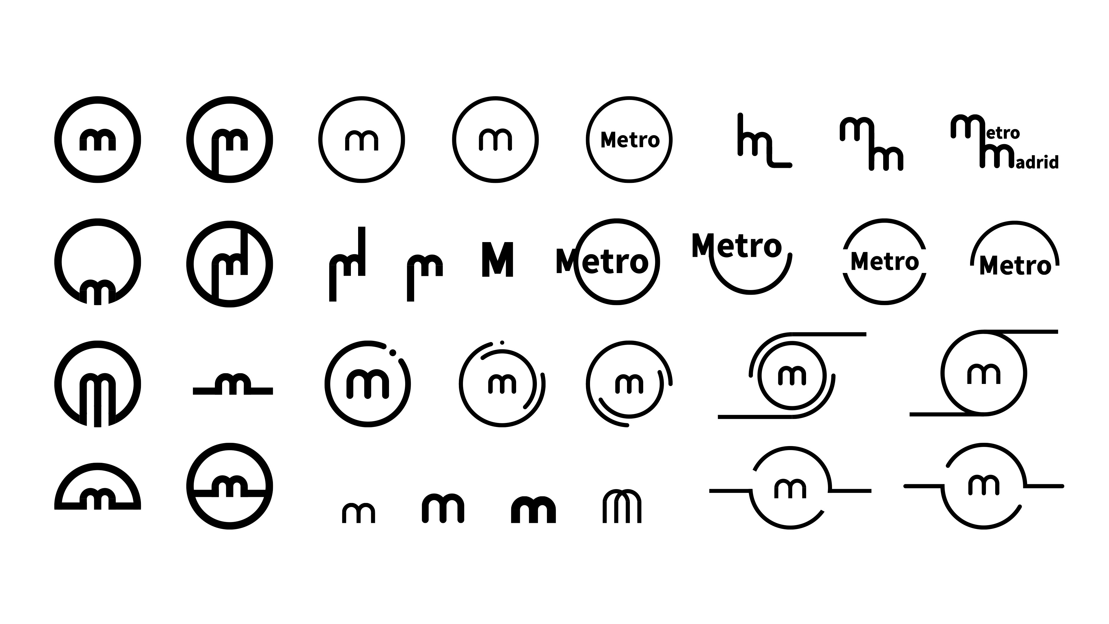
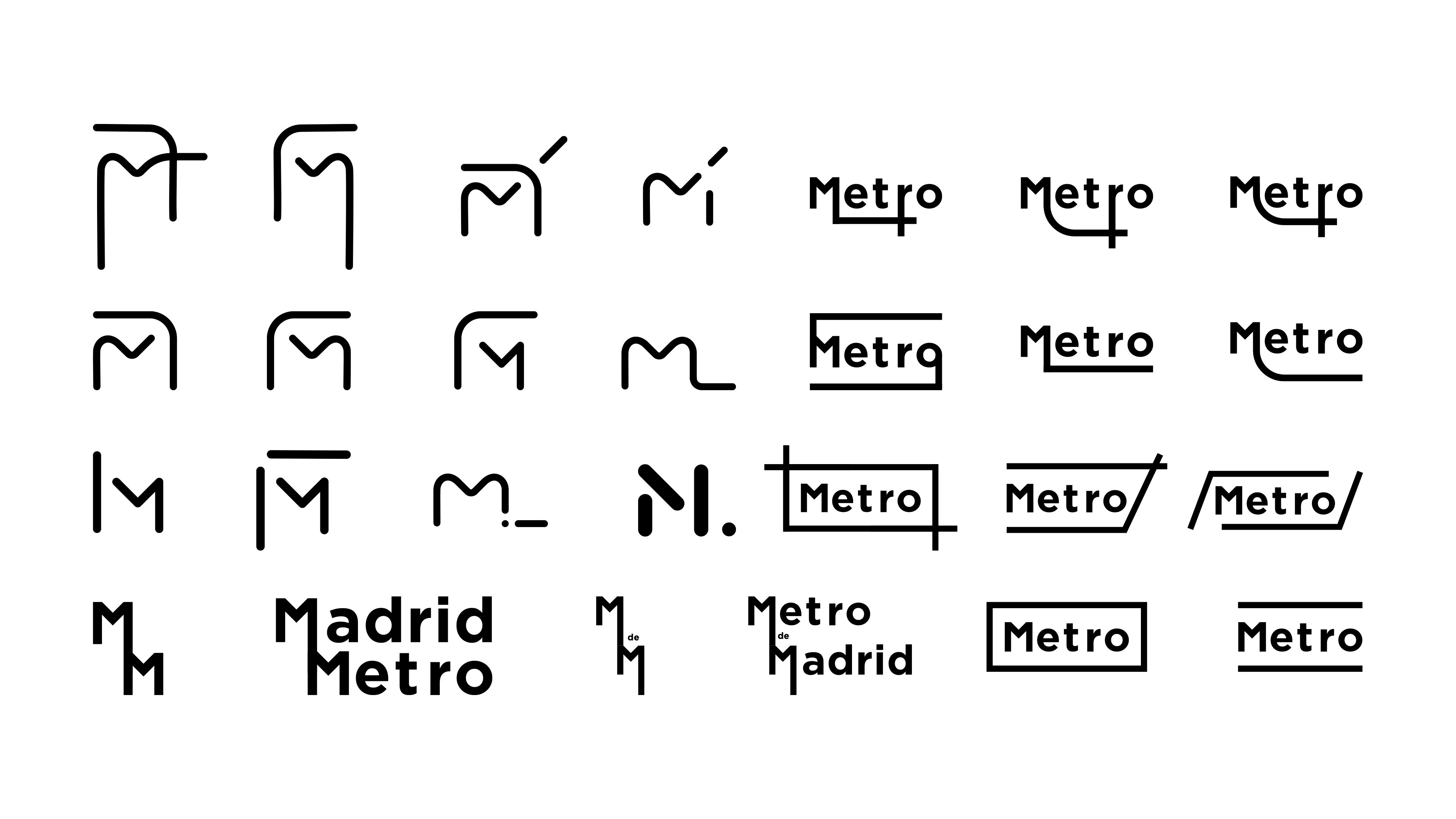

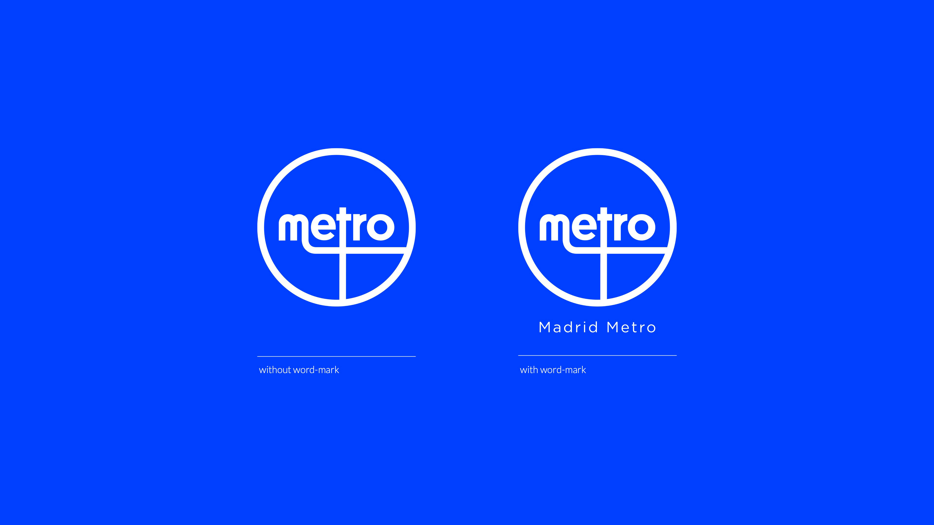


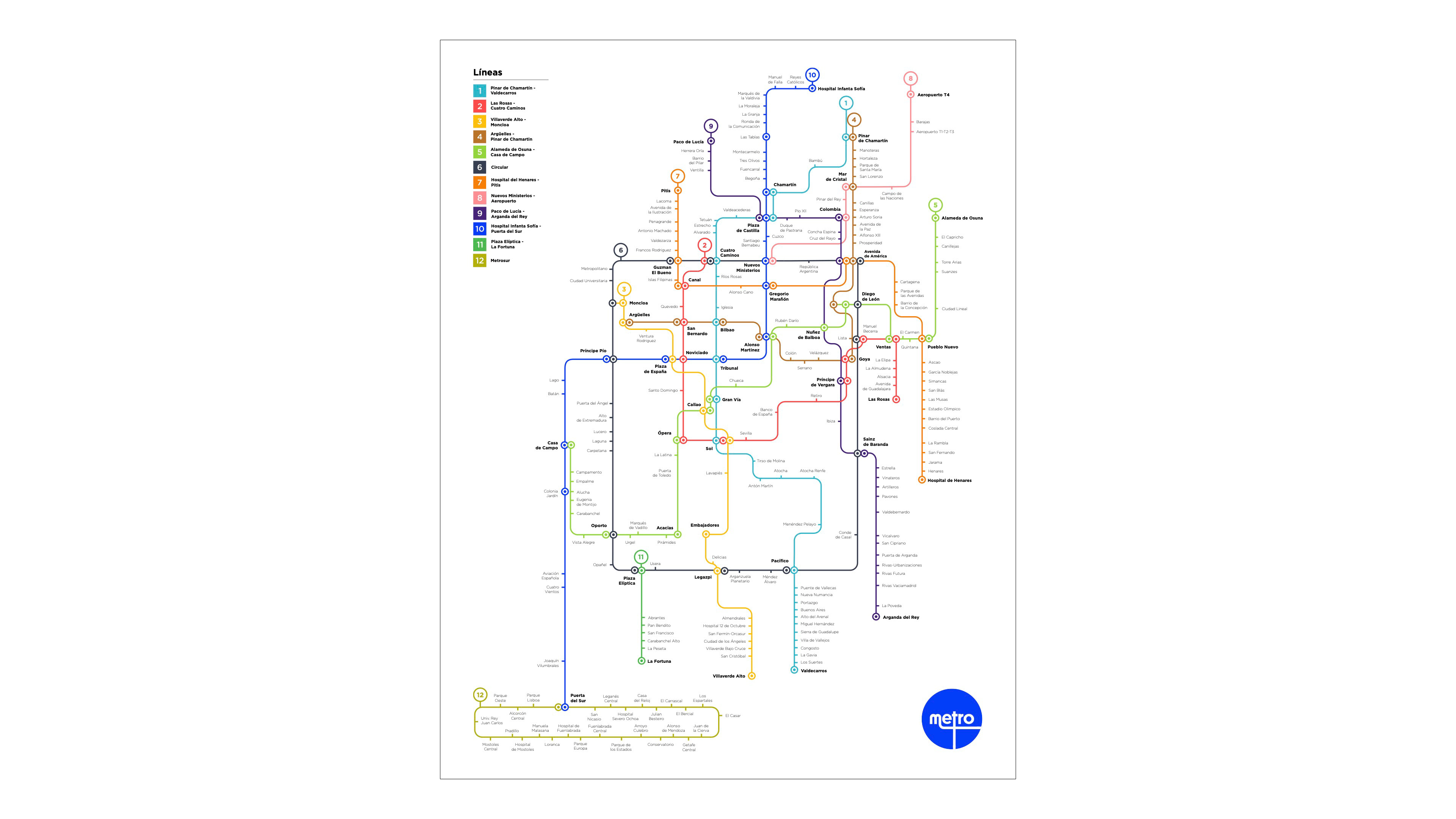
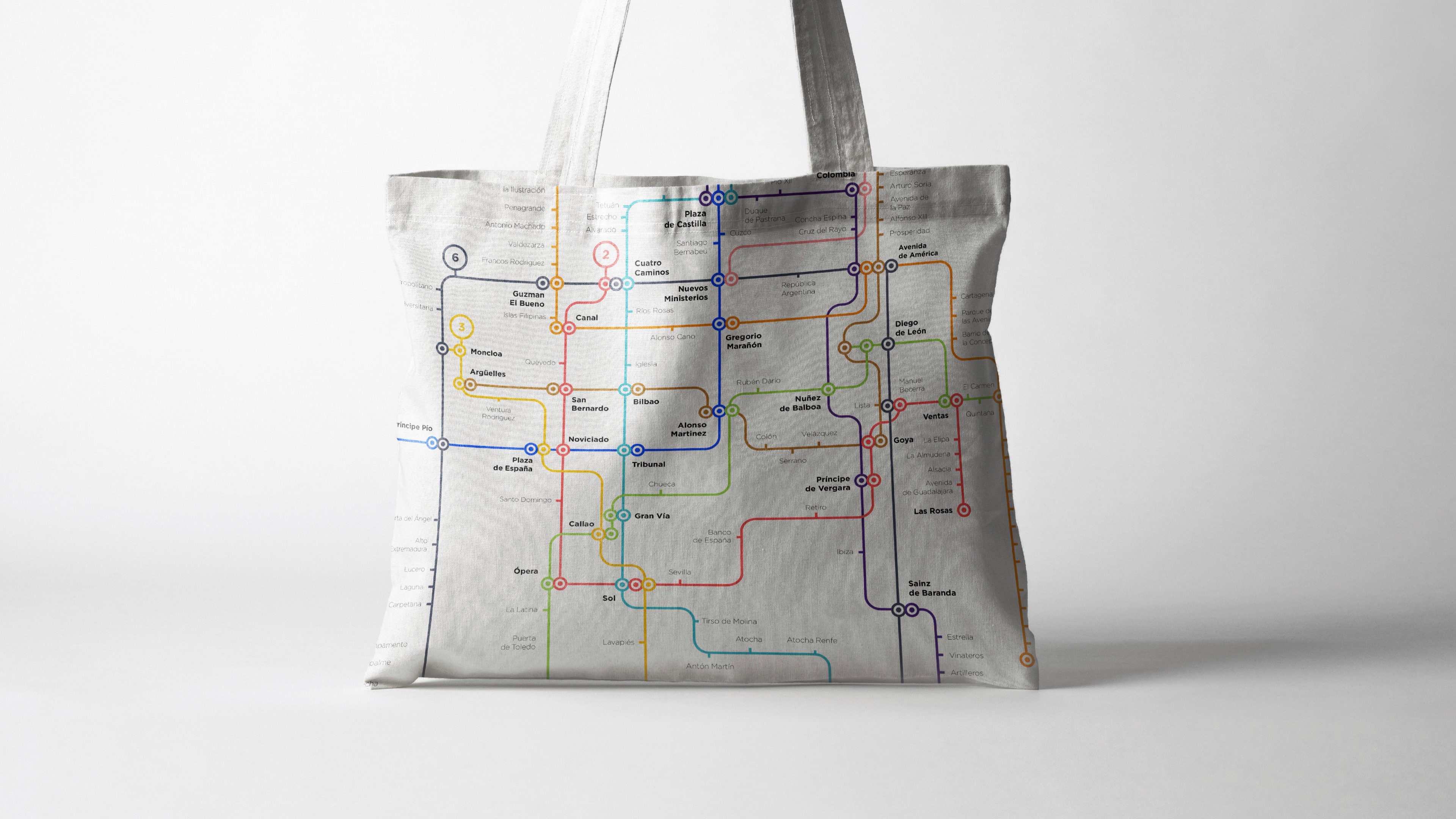
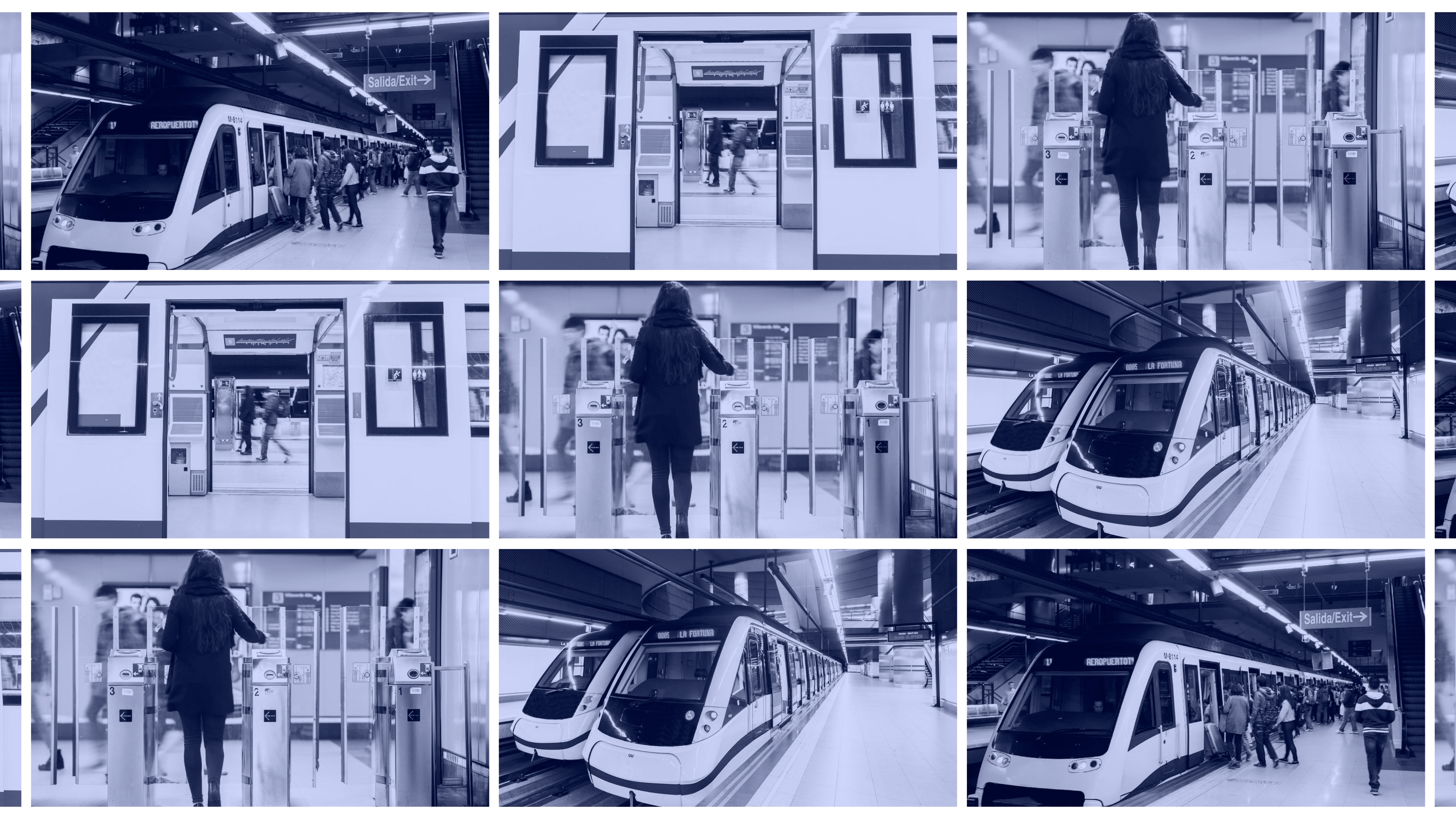
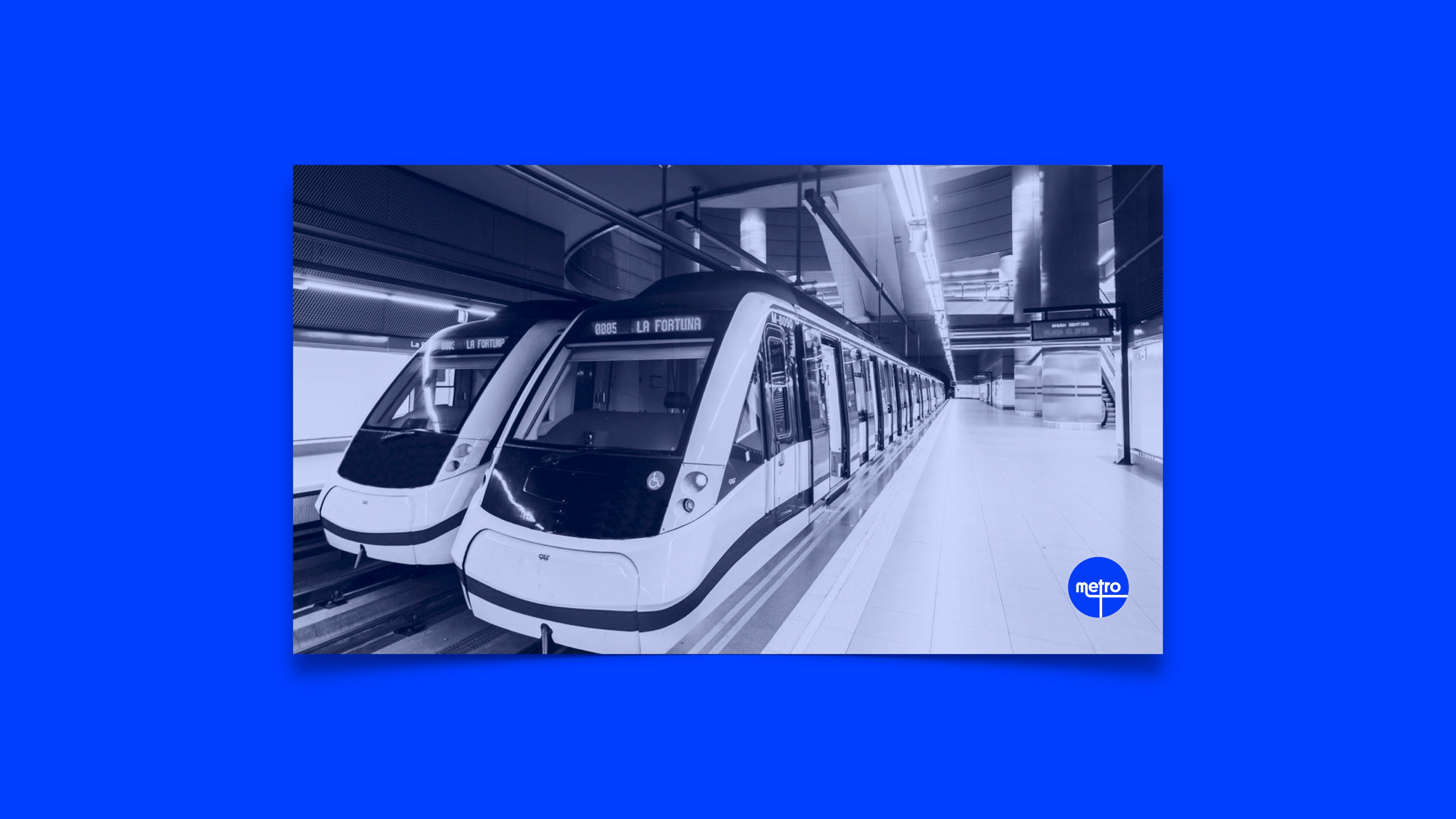
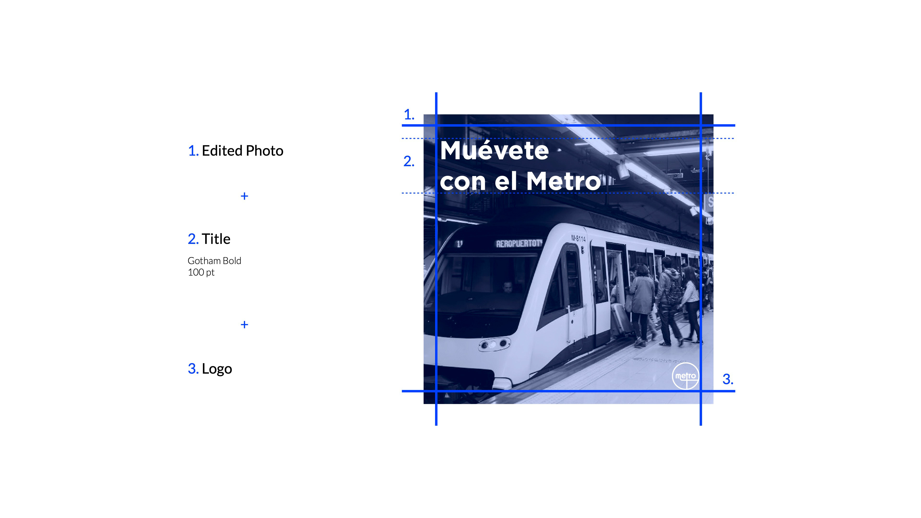
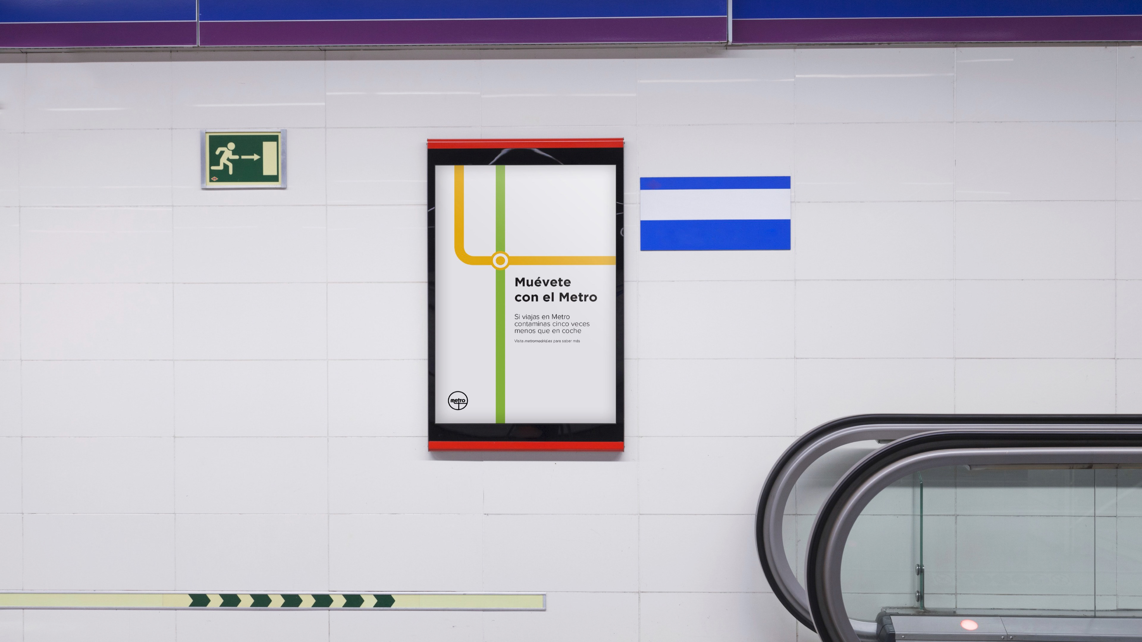
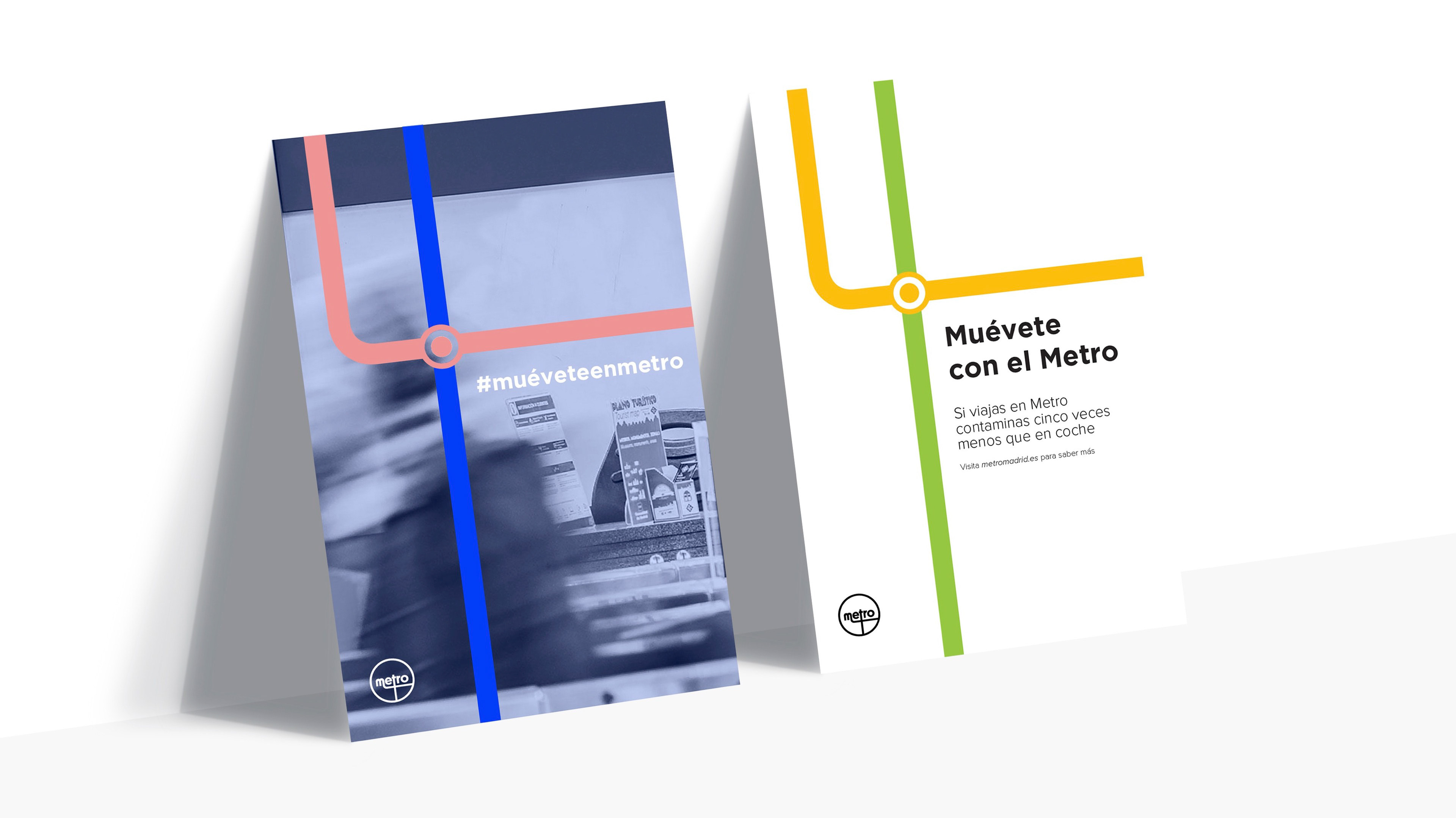
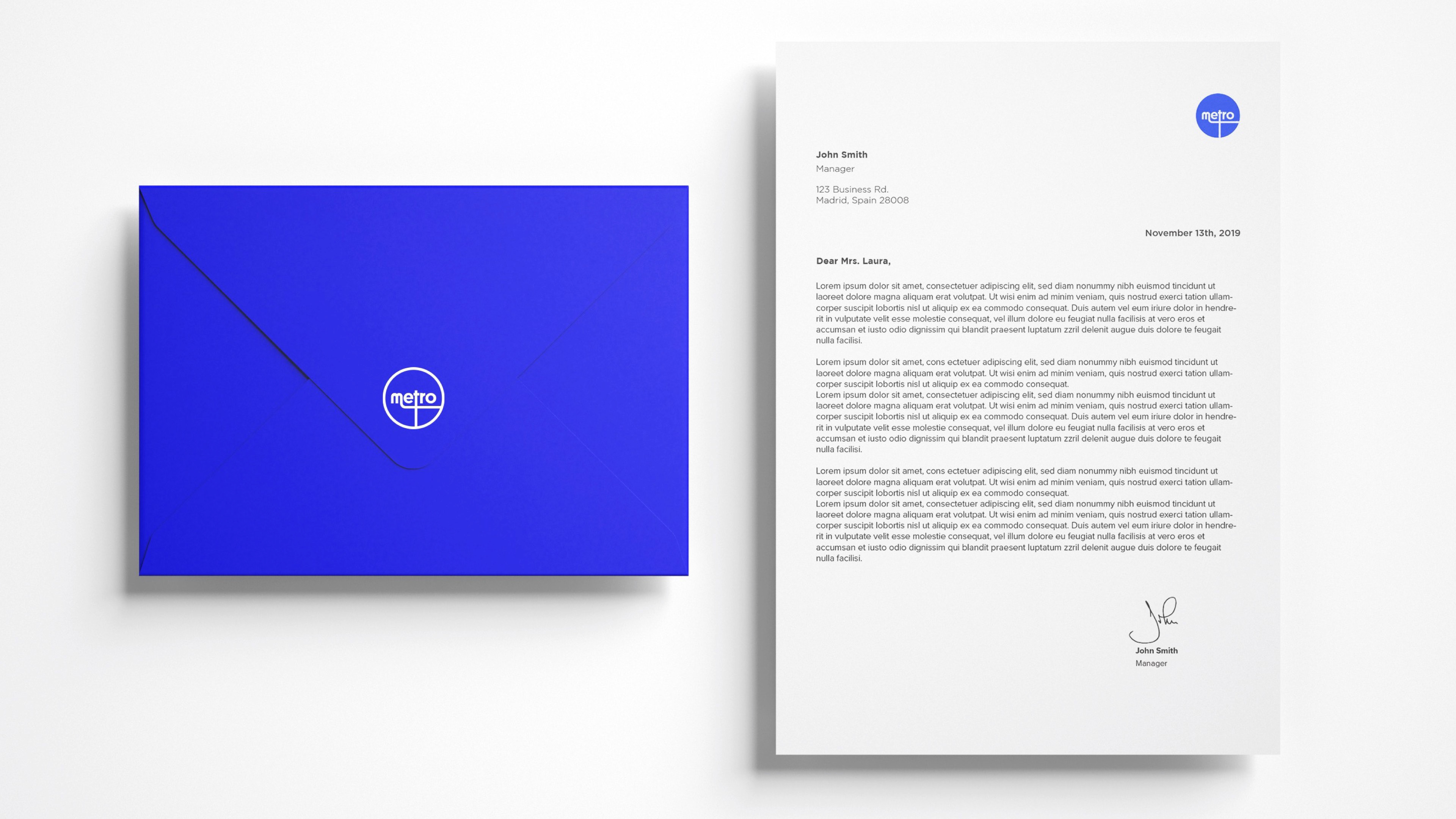
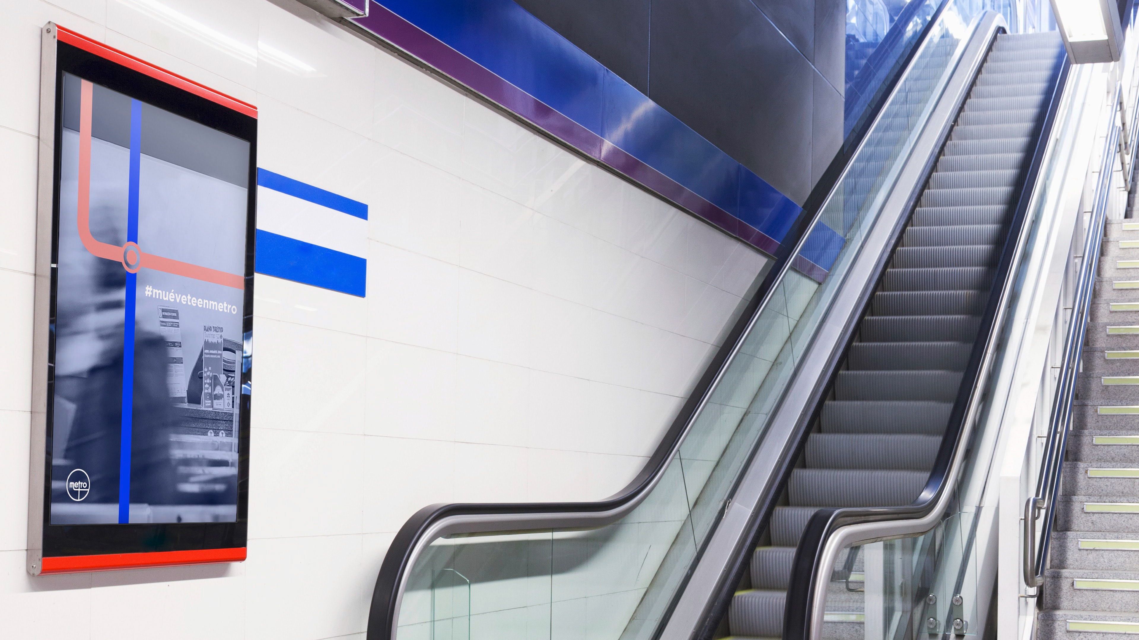
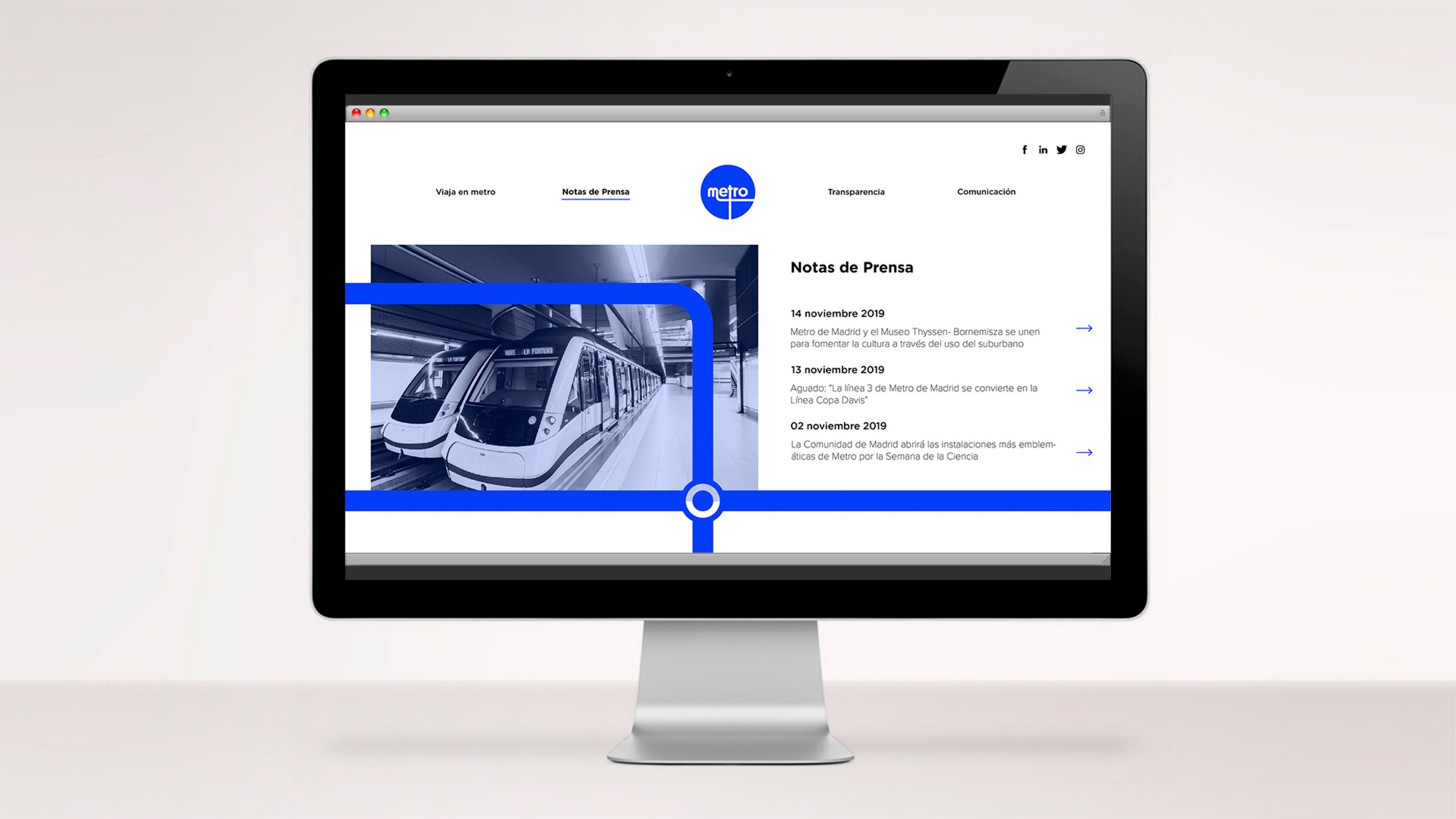
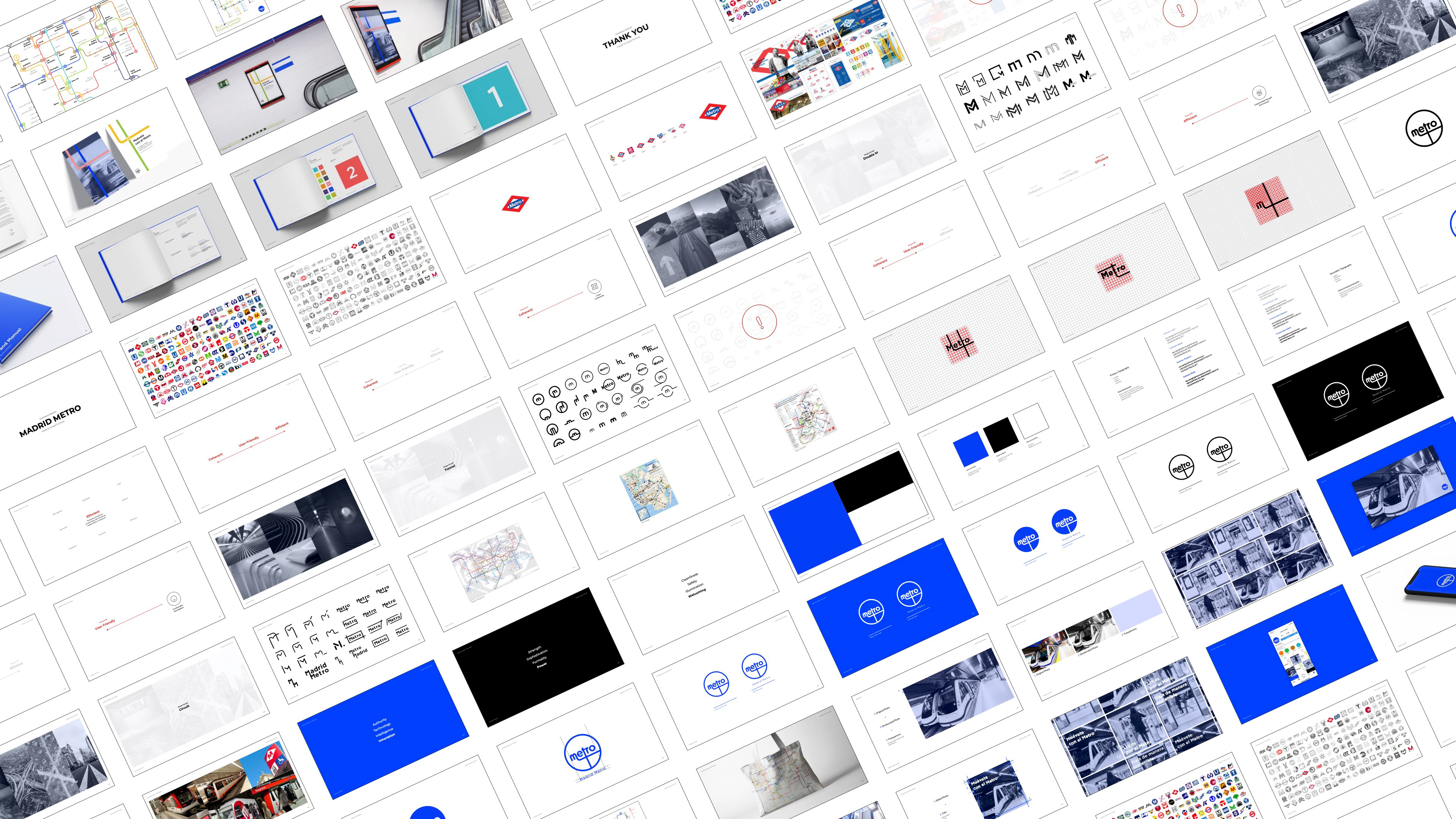
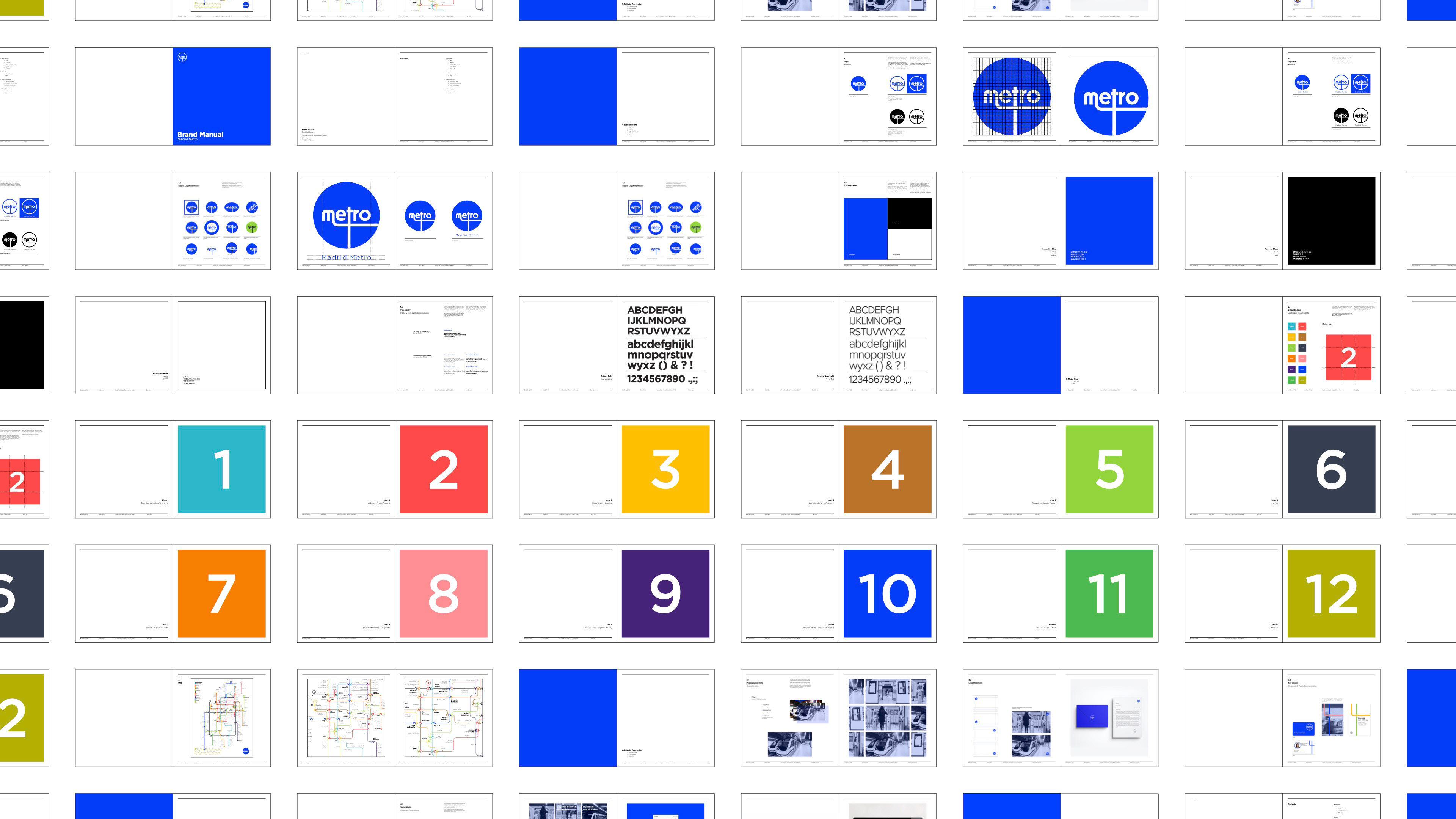
Two weeks devoted to research, brainstorm, ideate and rethink the visual identity of Metro de Madrid. We began by understanding its history and spotting inconsistencies across its touchpoints. Consequently, we established that coherence, user-friendliness and efficiency needed to become the three core values of the brand. With those in mind, we were able to define our decisions and design new elements that were later translated into a Brand Manual that includes the graphic standards.