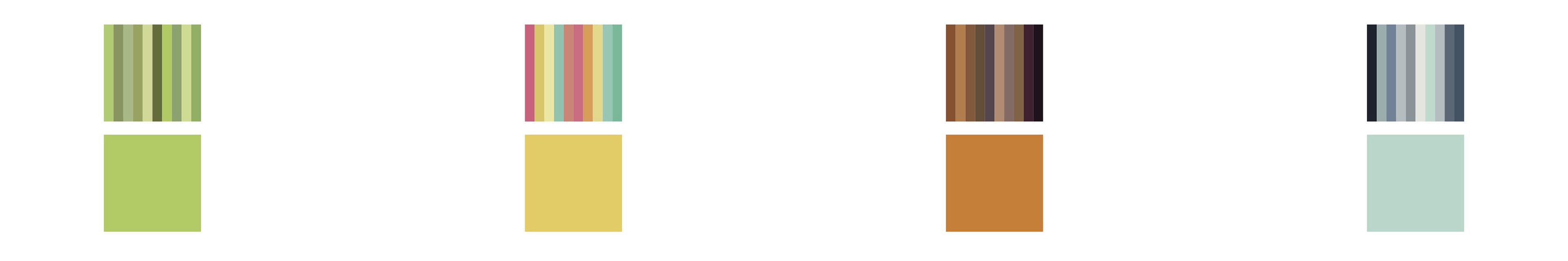
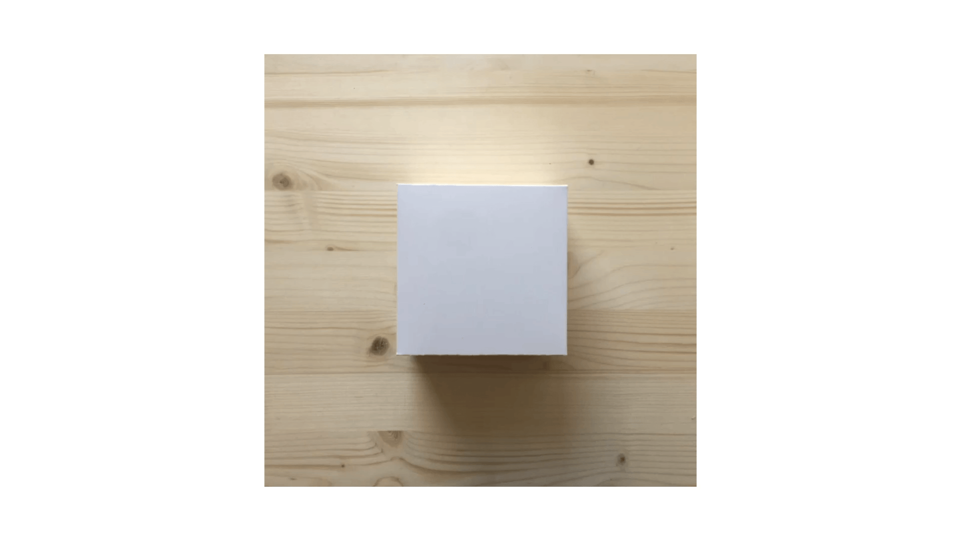
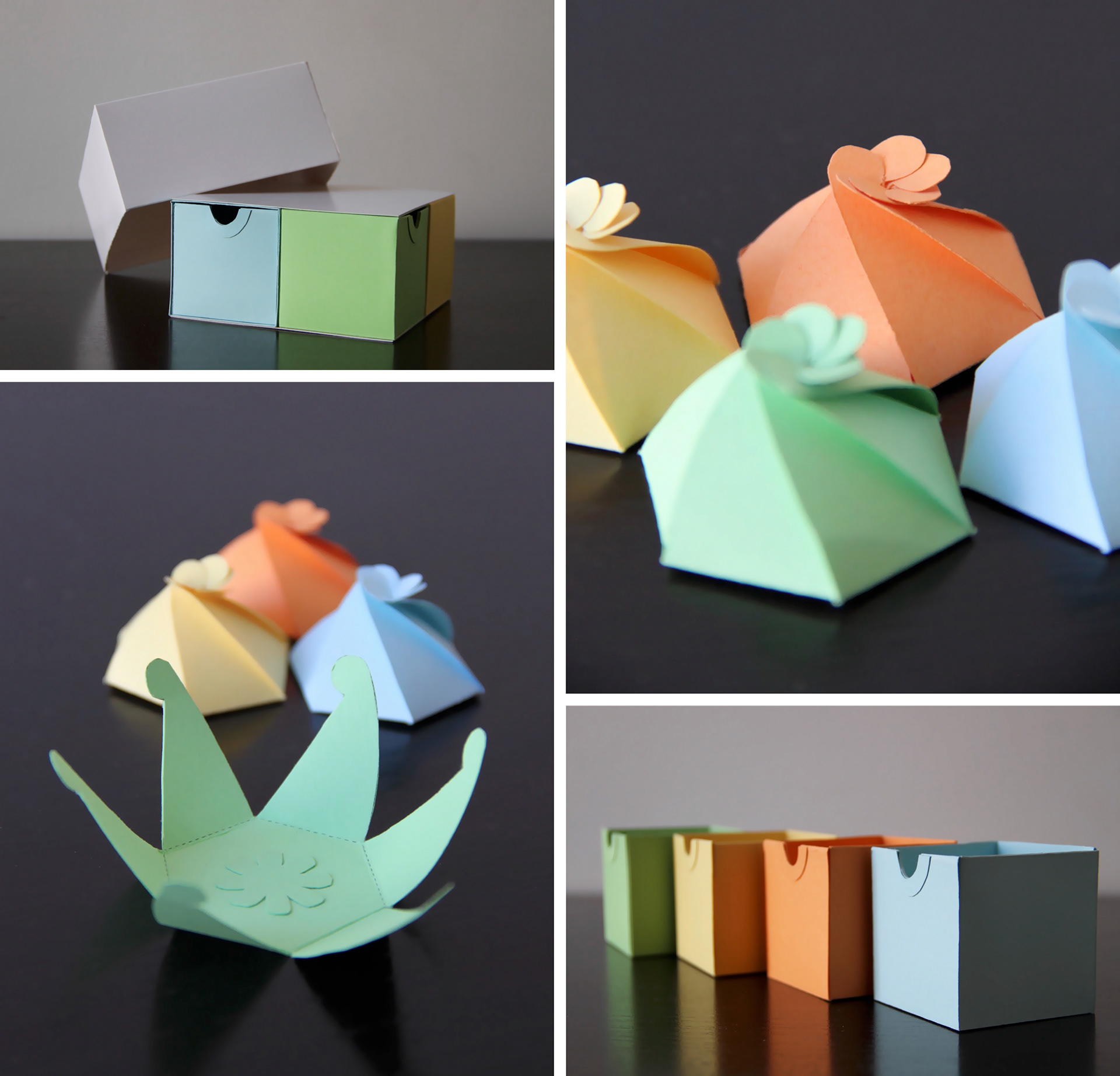
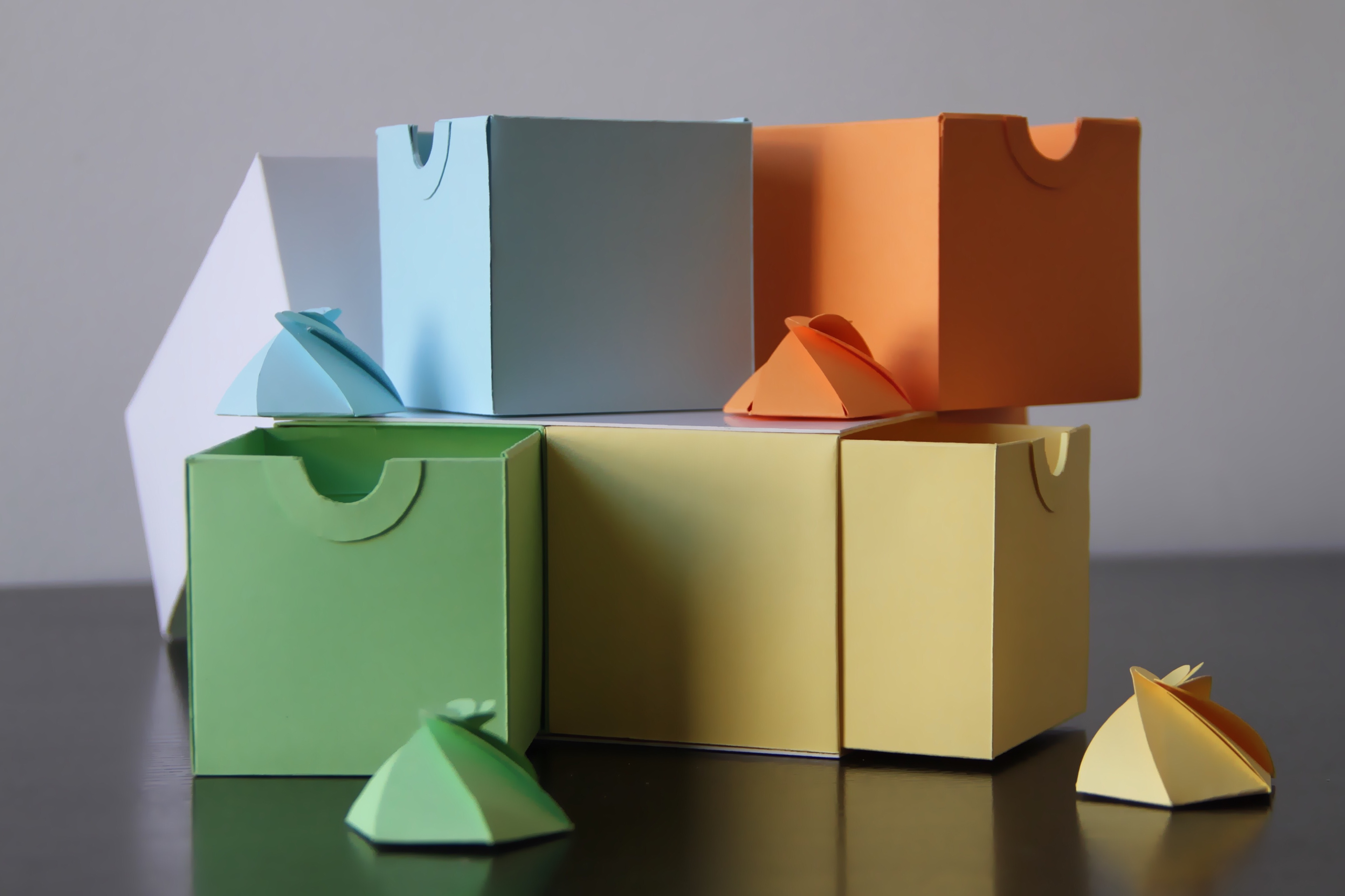

My starting-point was selecting the colour palette: green, yellow, orange and light blue, each representative of a season: spring, summer, autumn and winter, respectively. The packaging transitions from simplicity (cover) to complexity (swirl), evoking a sense of exploring and joining parts together to find the answer- like a treasure hunt! The user passes through an interesting colourful experience, instead of instantly showing what the package is about.