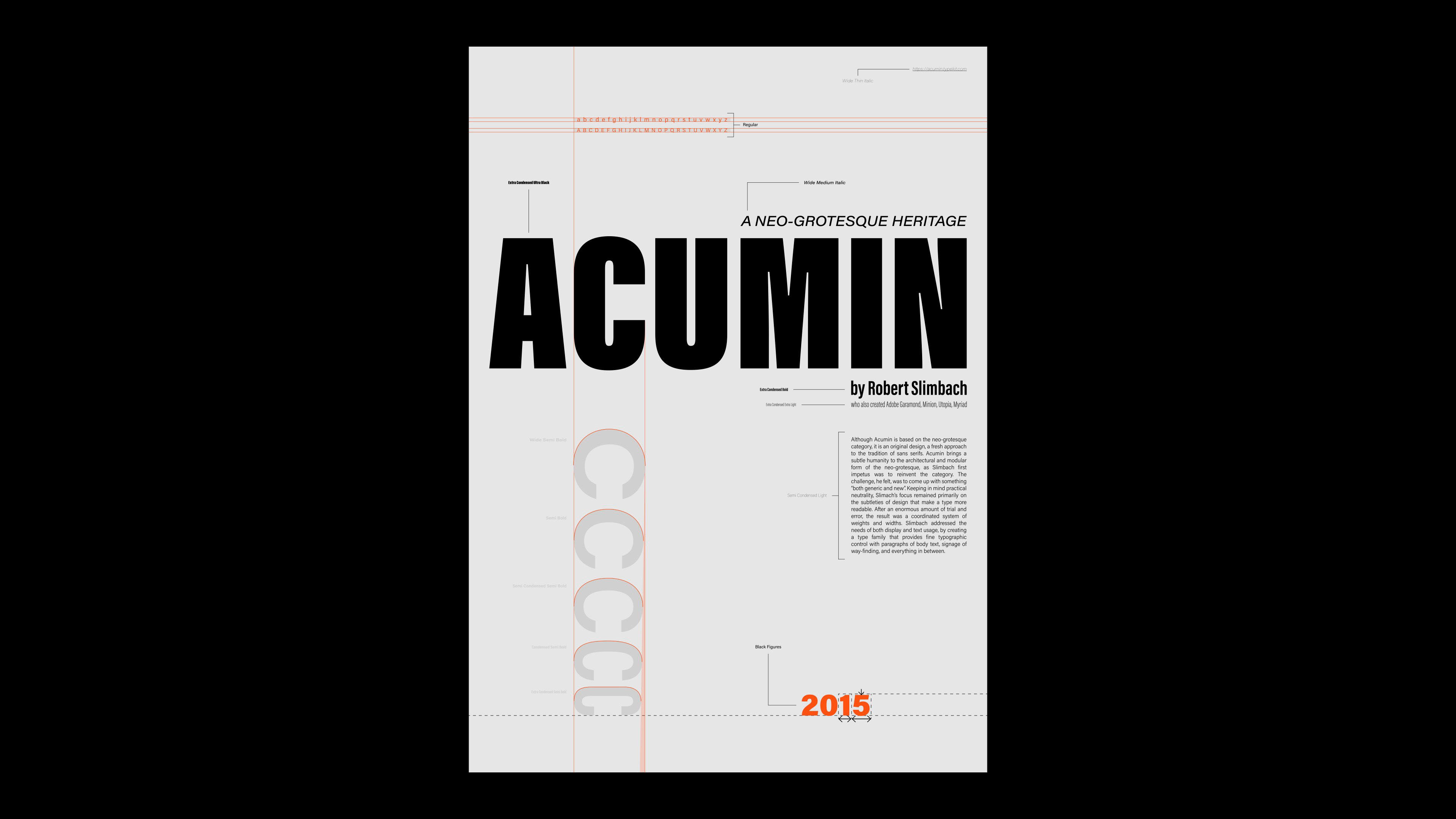
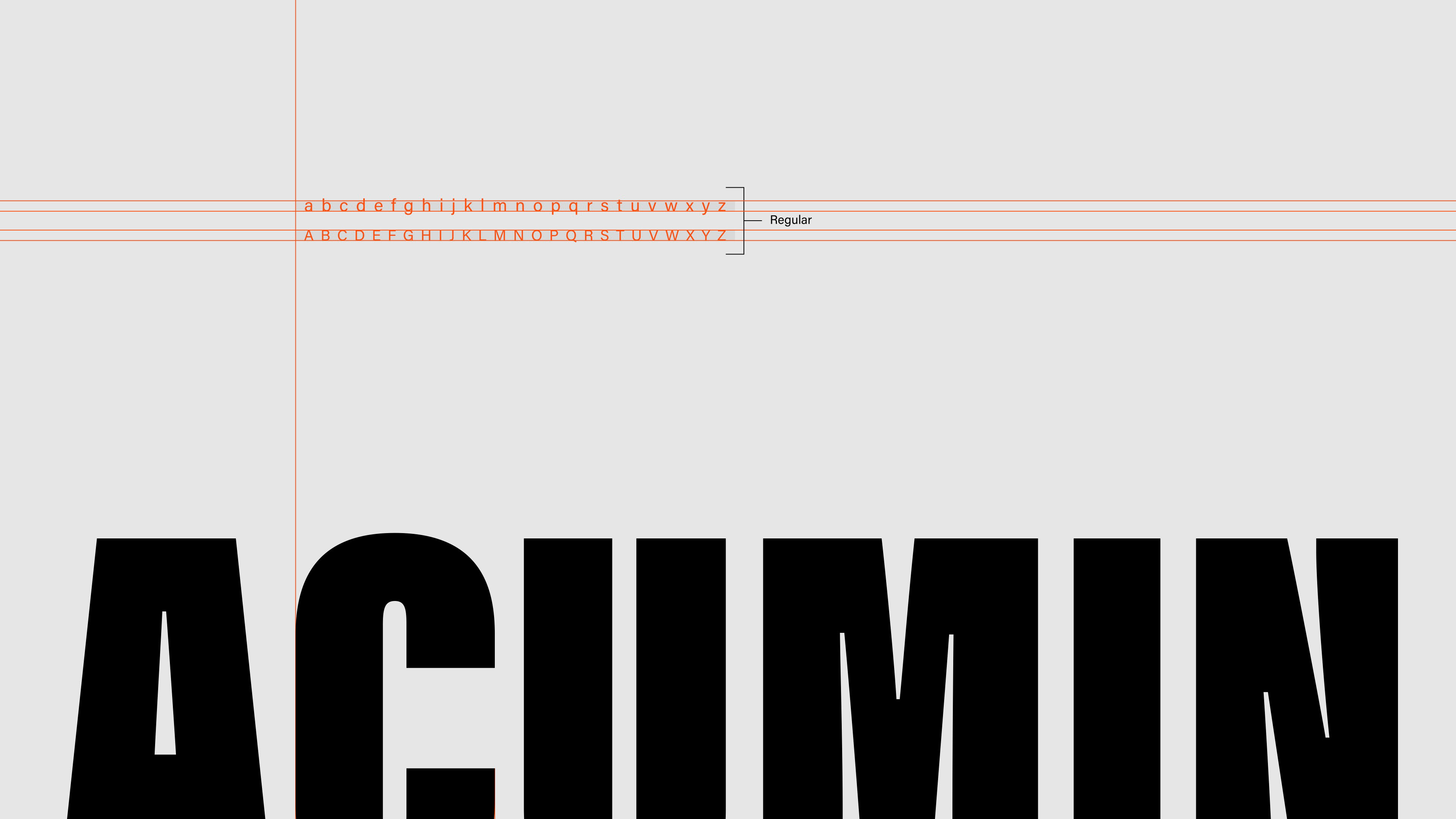
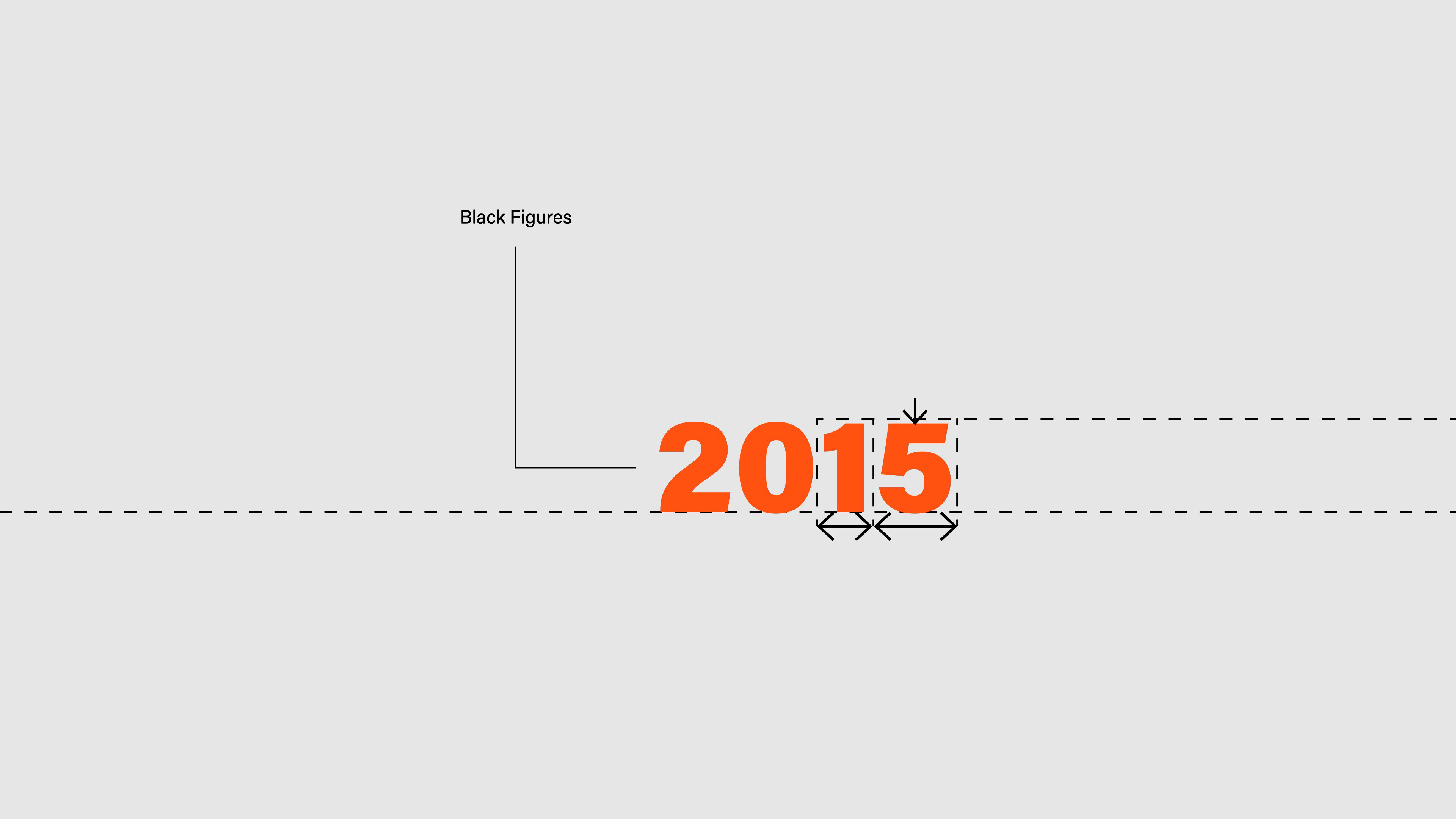
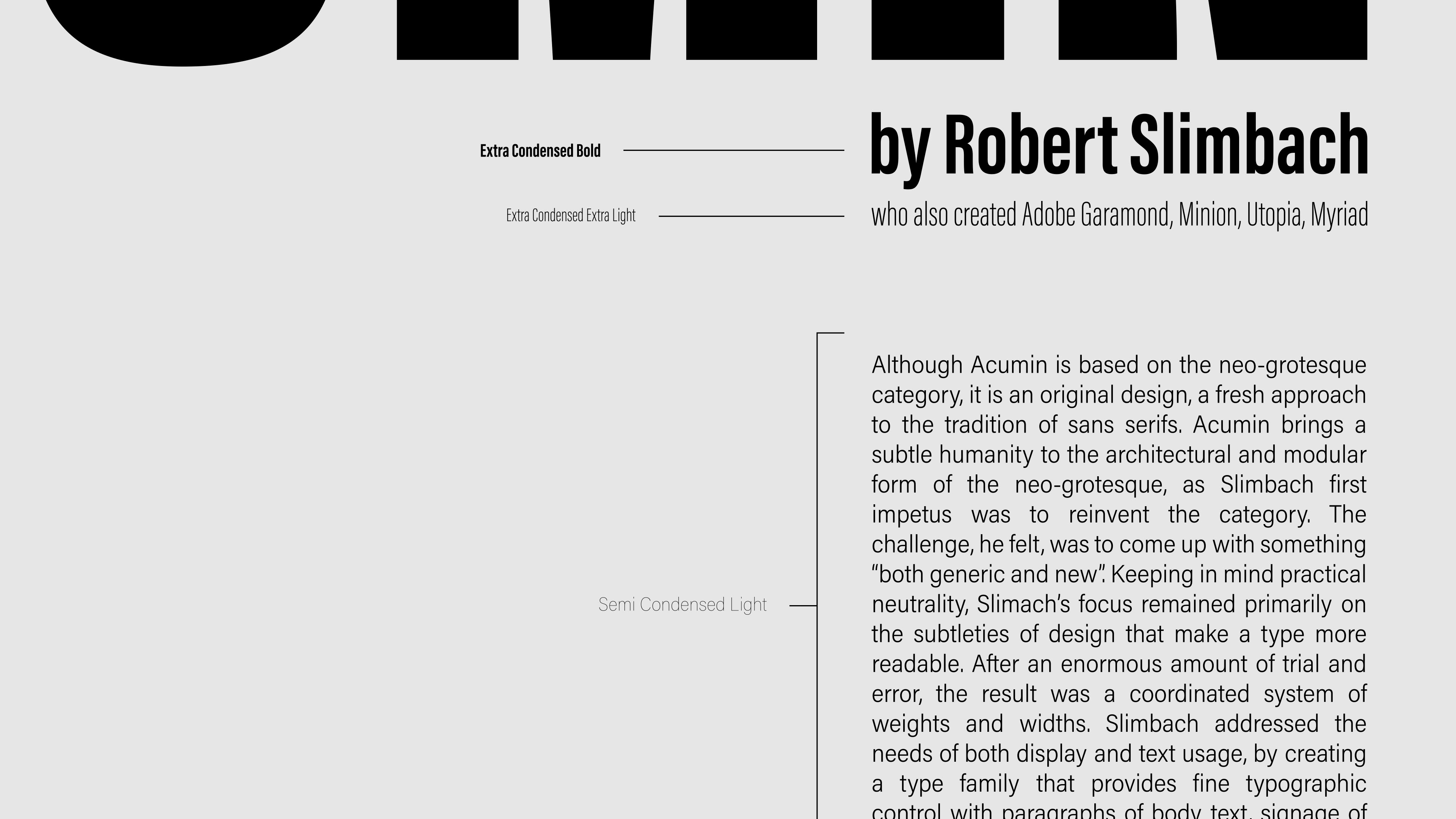

My typography of choice was Acumin: a neo-grotesque heritage created by Robert Slimbach. It’s a fresh approach to the tradition of sans-serifs, with a blocky appearance, and squarely-cut letters. Because of its coordinated system of weights and widths, the typeface to works well on various applications, in both display and text usage. My poster showcases Acumin’s versatile “personality” that creates typographic hierarchy with a consistent style.